

HOKA Membership
Role: Sole Product Designer and Creative Designer
Team: UX, Creative, Marketing
Scope: Research, UX strategy, wireframing, UI design, branding, in-store touchpoints, testing
I was a solo designer on a program that reached 2.06 million members and became responsible for 50% of HOKA's ecommerce revenue.
The problem
HOKA was acquiring customers at scale, but losing them just as fast.
There was no membership,
no loyalty program,
and no reason to come back.
The relationship ended at checkout.
When the company decided to launch a membership program, I was the sole designer responsible for the experience end-to-end.
Research: what makes people stay
Most programs focused on transactions. Very few built emotional connection.
The ones that actually retain users don’t.
They create belonging, early access, and exclusive experiences. This reframed the problem. Retention is not transactional, it is emotional.
design a membership that feels like joining a community, not subscribing to a list.
Audit: how top brands drive retention beyond discounts.

Mapping every touchpoint
To understand where membership should exist, I mapped the full customer journey across digital and retail.
Three critical friction points emerged:
users didn't understand the value proposition,
the sign-up flow had too many steps,
and there was no differentiation between members and non-members on the site.
Each friction point translated into a clear design decision.

This map showed where membership naturally fits into the journey, not as a feature, but as part of the experience.

From strategy to system
To scale this across teams and channels, I turned these decisions into a unified system. I led workshops across ecommerce, global UX, brand creative, retail operations, and marketing to align every team on the user journey before designing anything.


Building the brand identity
To support this system, I created a visual identity designed for clarity, scalability, and trust.
The goal was to balance premium feel with accessibility. Valuable, but frictionless to join.
I introduced a blue-tinted black to convey trust and performance, paired with a warm off-white to reduce visual fatigue. A/B testing showed a 22% reduction in eye strain and improved brand trust compared to pure black and white.
This identity became the foundation for every membership interaction, from acquisition to retention.
The system was designed to scale across every touchpoint: Digital screens, email headers, in-store signage, product tags, and checkout displays.
One system. Dozens of touchpoints. Fully consistent.
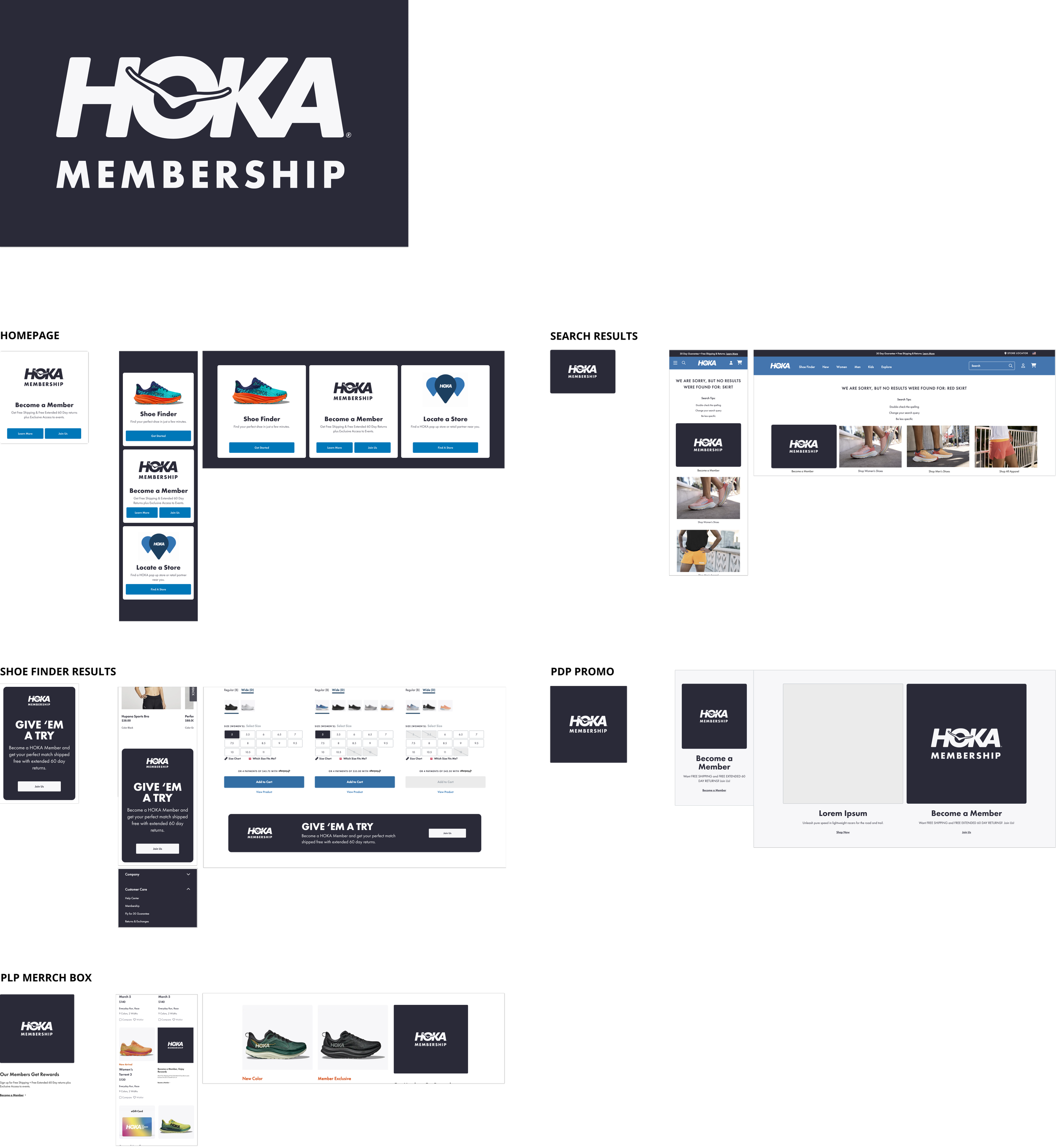
Designing the experience
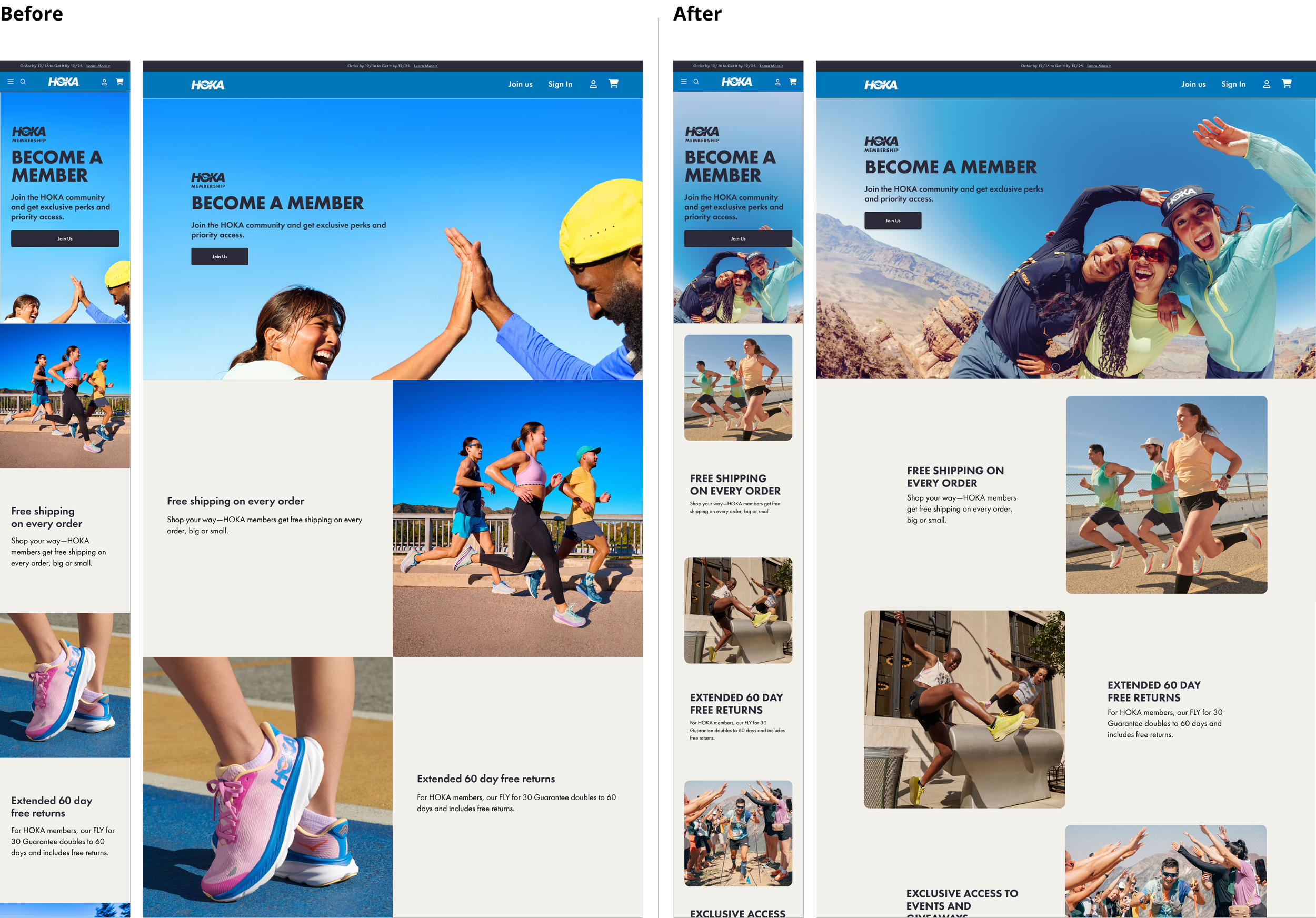
Landing page
I started with the journey map and user need, then moved to wireframes to validate the structure and flow with the team. Once we were aligned, I built the high-fidelity design in Figma using the design system and CMS templates I'd created. When the CMS templates were updated, I rebuilt the entire landing page on the new system and refined the experience to remove friction and make the value immediately clear.
The result: 56% of the entire CRM database signed up for membership in the first three weeks.
The membership landing page before and after applying the design system and CMS templates I built:
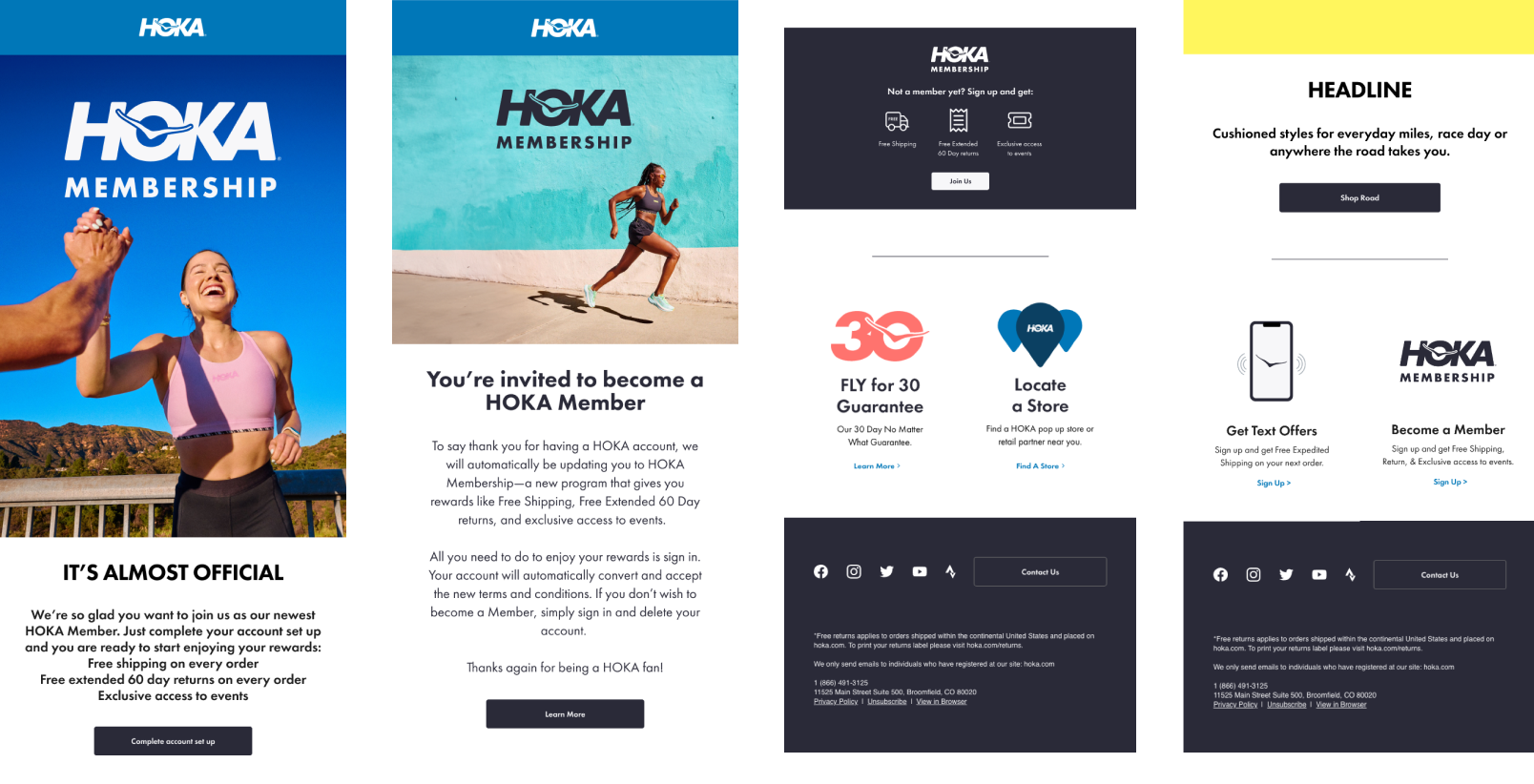
Email and SMS
These channels became the primary growth engine:
I designed the complete welcome series, promotional campaigns, and transactional emails. 70% of all membership landing page traffic came from the channels I designed: email broadcasts, transactional campaigns, and the SMS welcome series.
The welcome series alone created a 51% spike in traffic from email to the Shoe Finder tool.
Users weren't just signing up. They were engaging. They were exploring. The onboarding flow was doing its job.
Email and SMS combined drove 28% year-over-year revenue growth.
Product pages, Pop-ups and banners
I integrated member pricing and exclusive access badges directly into the shopping experience. Users could see the benefit of membership while they were browsing, not just on a dedicated landing page. Membership became part of shopping, not separate from it.
I designed contextual sign-up prompts that appeared at key moments in the shopping journey. The timing mattered: too early feels aggressive, too late misses the moment. I tested placement and triggers until the prompts felt like suggestions, not interruptions.
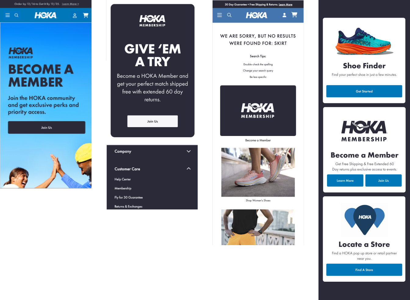
The footer nobody noticed
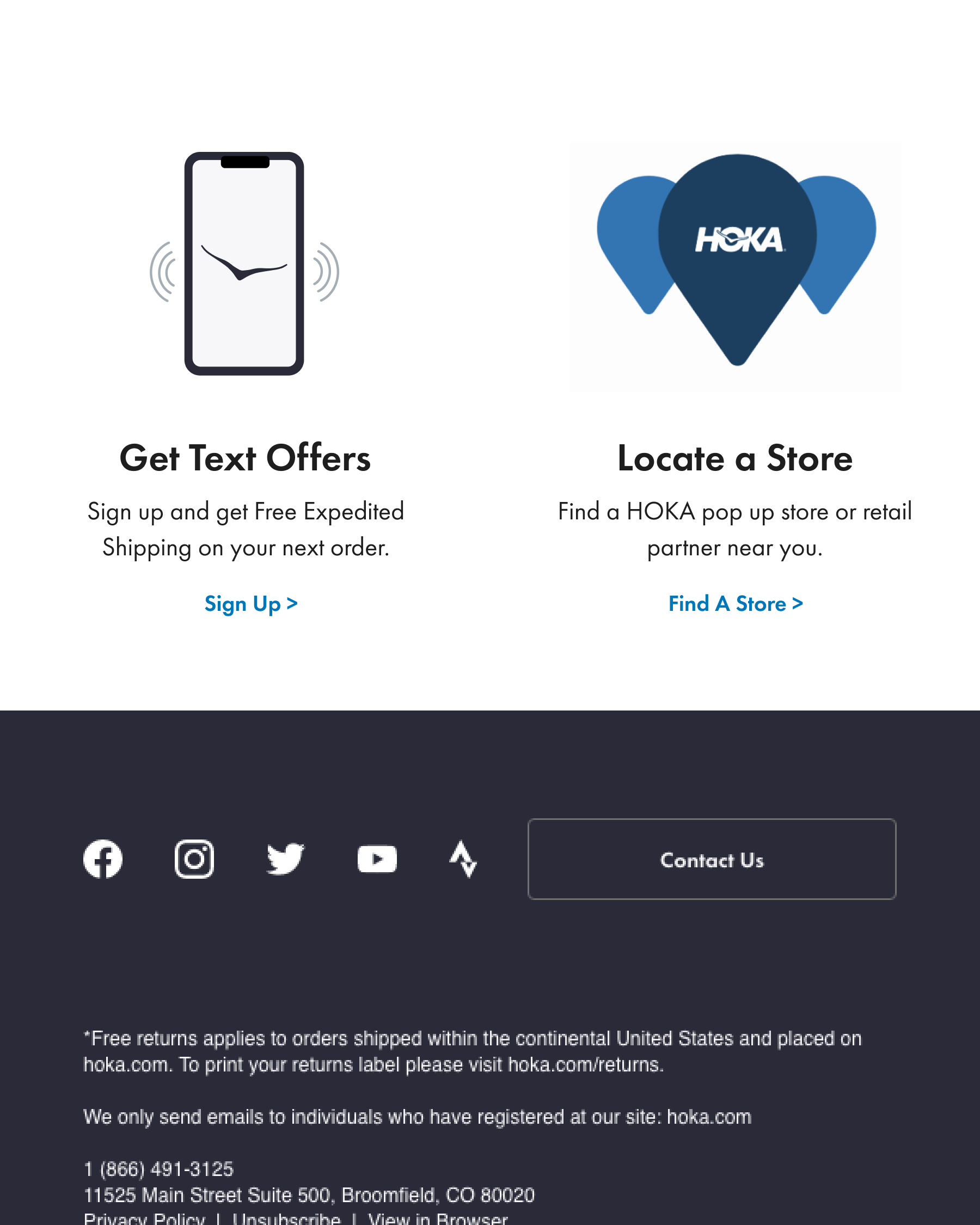
The site footer had a generic CTA that had been there for months. Nobody was clicking it. I designed a new SMS membership sign-up to replace it: a simple phone illustration with a clear "Get Text Offers" headline and a value-driven hook offering free expedited shipping on the next order.
Same location. Same size. Completely different intent. I designed the visual, wrote the copy, and positioned the offer.
That single swap drove a 46% lift in conversion rate.
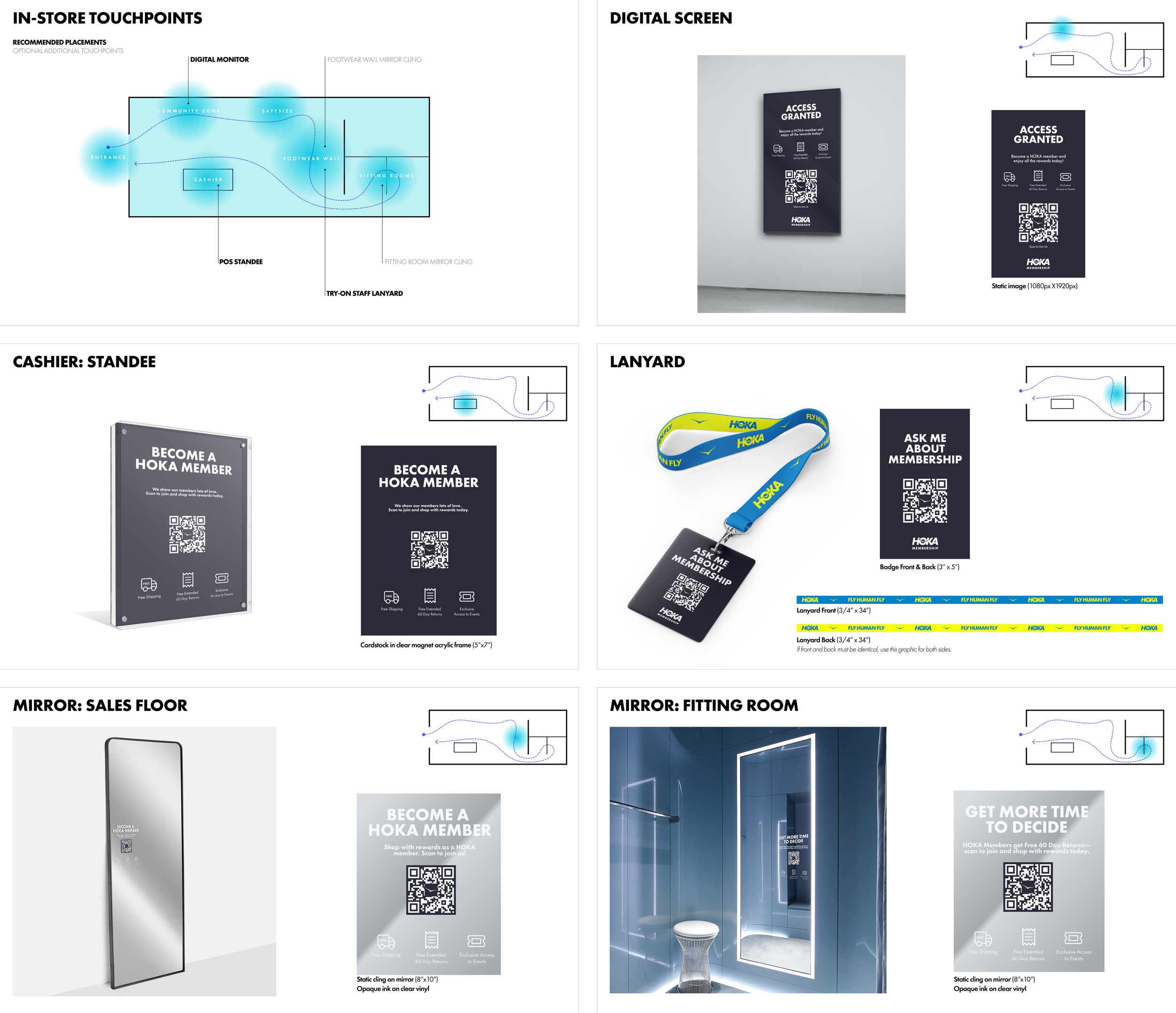
From screen to store
The system extended beyond digital into physical retail. I designed the membership experience across physical retail, translating the system into real-world touchpoints across 30+ HOKA stores.
Instead of relying on a single conversion moment, I designed a layered in-store journey.
Passive touchpoints build awareness, while active touchpoints enable quick, low-friction sign-ups.
The system was mapped across the in-store journey:
Entrance signage introduces membership the moment customers walk in
Digital screens reinforce benefits throughout browsing
Cashier standees capture attention at high-intent moments
Mirror clings place the message directly in fitting room decision points
Staff lanyards with QR codes enable quick, conversational sign-ups without adding new devices
Each touchpoint uses the same visual system, adapting to context while staying consistent across formats.
The result was a seamless experience that connects physical and digital. 49% of in-store customers became members, with a 25% ecommerce capture rate from those users.
The word that changed everything
After launch, I tracked performance using Google Analytics, CRM data, heatmaps, and session recordings. Sign-ups were strong, but I noticed something: Heatmaps showed users hovering over the sign-up button without clicking.
They were interested, but unsure.
Surveys revealed why: users thought membership might cost money. I tested one change:
“Join HOKA Membership” → “Join HOKA Membership. It’s free.”
Conversions increased by 16%.
The quarterly business review confirmed it: capture rate was significantly higher after adjusting enrollment language to include the word "free." Most active enrollment periods spiked in January and March, directly following the language update.
This is the insight I carry into every project: the biggest design improvements are often not visual. They're linguistic. Users don't read your interface the way you designed it. They read it the way they fear it.
What I learned
I was the sole designer from concept to launch; across product, brand, CRM, and retail. That level of ownership shifted my thinking from deliverables to outcomes.
The program reached 2.06 million members. It became responsible for 50% of total ecommerce revenue. 49% of all customers joined. But the metric I keep coming back to is the 56% CRM capture in three weeks, because that number proved something specific about the experience I designed: people didn't just see the membership. They wanted it.