

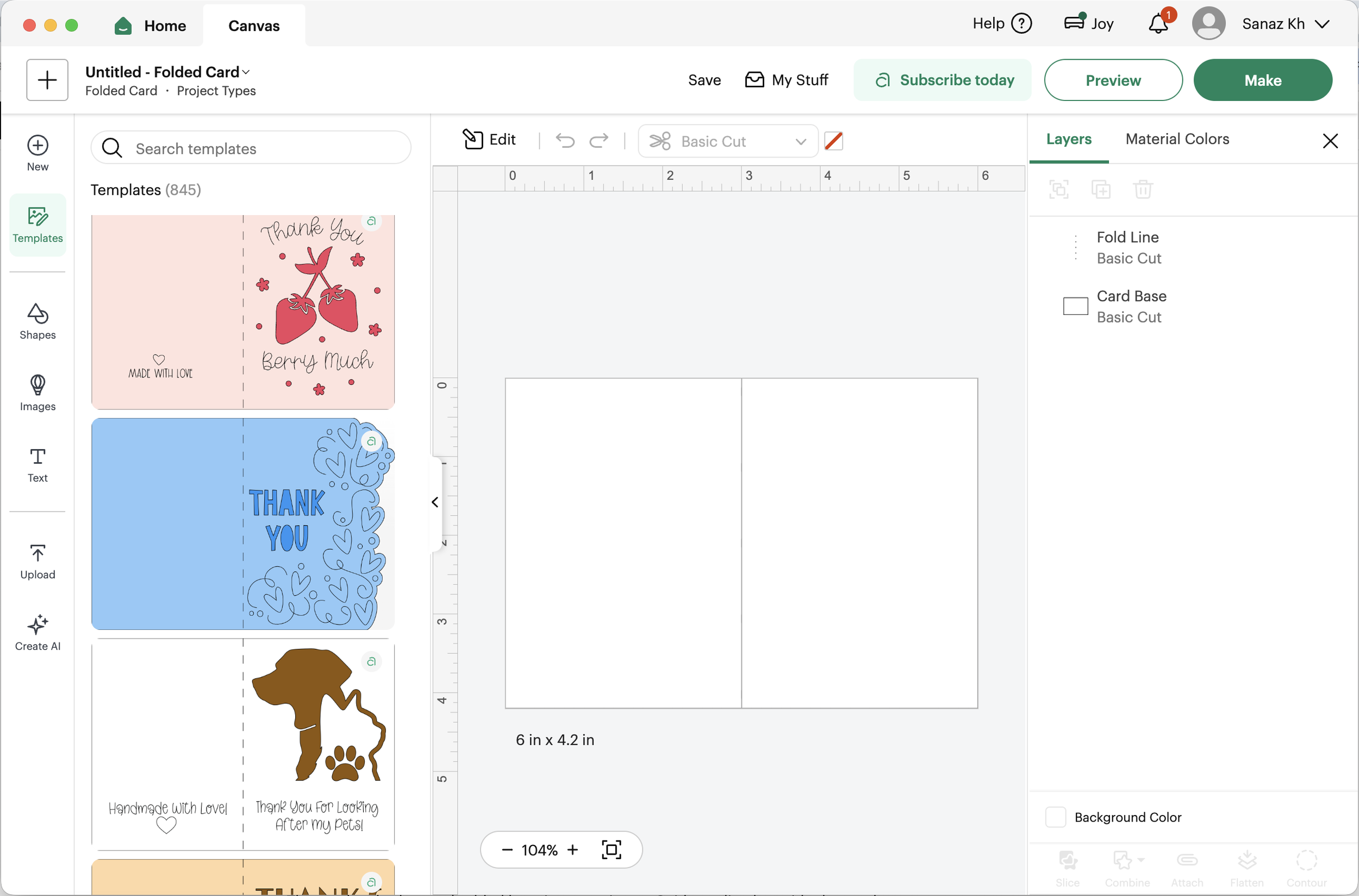
Cricut Design Space
Role: UX and UI Designer
Team: Product, Engineering, Marketing, Creative
Scope: Research, interaction design, system design, prototyping, UI, motion design
A two-part redesign focused on the moments where users were losing confidence inside the canvas and inside the funnel.
Overview
Cricut Design Space serves a massive crafting community across desktop and mobile. But a quiet pattern was breaking the experience. Users were leaving the product to learn how to use it. Some never came back.
The product wasn't broken. It just didn't meet users where their learning actually happened.
And on the subscription side, users were entering and exiting key moments without confidence in their decision.
I led two initiatives that approached this from different angles:
Embedding guidance directly into the creation experience.
Rebuilding the subscription flow at the exact moments where confidence was being lost.
Part 1: From Video Feature to In-Product Learning System
The Problem
Cricut users relied heavily on external platforms like YouTube, TikTok, and Instagram to learn how to use the product.
They opened a second tab, switched to their phone, or cast videos to a TV. Every time they needed help, the creative workflow inside Design Space stopped.
Some never came back.
The product had no embedded learning experience. Guidance lived outside the product.
User leaving product OR empty canvas with no guidance

No in-product guidance, users leave the workflow
Research
I conducted user surveys to understand how people engaged with crafting content.
Key patterns emerged:
Watching tutorials was intentional and often started before a project
YouTube was the dominant platform
Most users watched on their phones, but wanted guidance visible while working
Users struggled to follow instructions while actively creating
I also ran a heuristic analysis across YouTube, MasterClass, Etsy, Instagram, and TikTok.
Strong patterns:
Preview on hover
Visible metadata on content tiles
Ability to save without friction
Weak patterns:
Forcing users into full video views before interacting
Insight:
Users don’t want a video library. They want guidance next to their work.
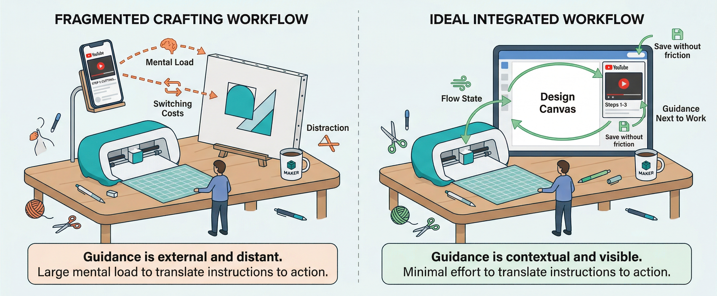
Users rely on external platforms for guidance
Designing the System
I led the design of a cross-platform video system, defining the interaction model, player behavior, and integration across the homepage and canvas.
The system included:
Video tiles with hover previews on the homepage
A persistent player that followed users into the canvas
Minimize and maximize controls
Pause and resume across contexts
The interaction model was built on a single principle:
Learning and creating should happen at the same time, not one after the other.
System overview:
Homepage tiles
Player
Canvas integration
Video system from discovery to in-canvas learning
What It Became
Cricut’s Learning Plan is an onboarding system that teaches users core crafting skills across four sections: Starter, Vinyl, Paper, and Iron-on.
Before this work:
Users had to exit tutorials to try something, losing progress and context.
After:
Users could watch a step, minimize the lesson, apply it on their canvas, and return seamlessly.
The experience introduced:
A collapsible tutorial layer inside the canvas
Step-by-step guided animations
Persistent progress across steps
The ability to learn without interrupting creation
I also created the animation content for each lesson, designing the motion system that powered the guidance experience.
Result:
Users could learn and create simultaneously, reducing friction and supporting continuous flow.
What This Taught Me
The original video feature was descoped, but the system survived.
The research was still valid. The interaction model still solved the right problem. It simply found a better place to live, inside Cricut's Learning Plan.
This is the lesson I carry into every project now: design the system, not the feature. Features get cut. Systems survive pivots. The deeper your work goes into the underlying model, the more resilient it becomes to roadmap shifts, leadership changes, and technical constraints.
Part 2: Subscription Redesign
The Problem
Cricut Access is the paid subscription that unlocks images, fonts, and ready-to-make projects. But the flow had a quieter issue than pricing.
It was a confidence problem.
Users entered the flow without understanding what they were getting. They completed the flow without feeling confident in their decision. Hesitation going in. Weak conviction coming out.
The Pain Points I Was Designing Against
Three patterns kept showing up in the existing experience:
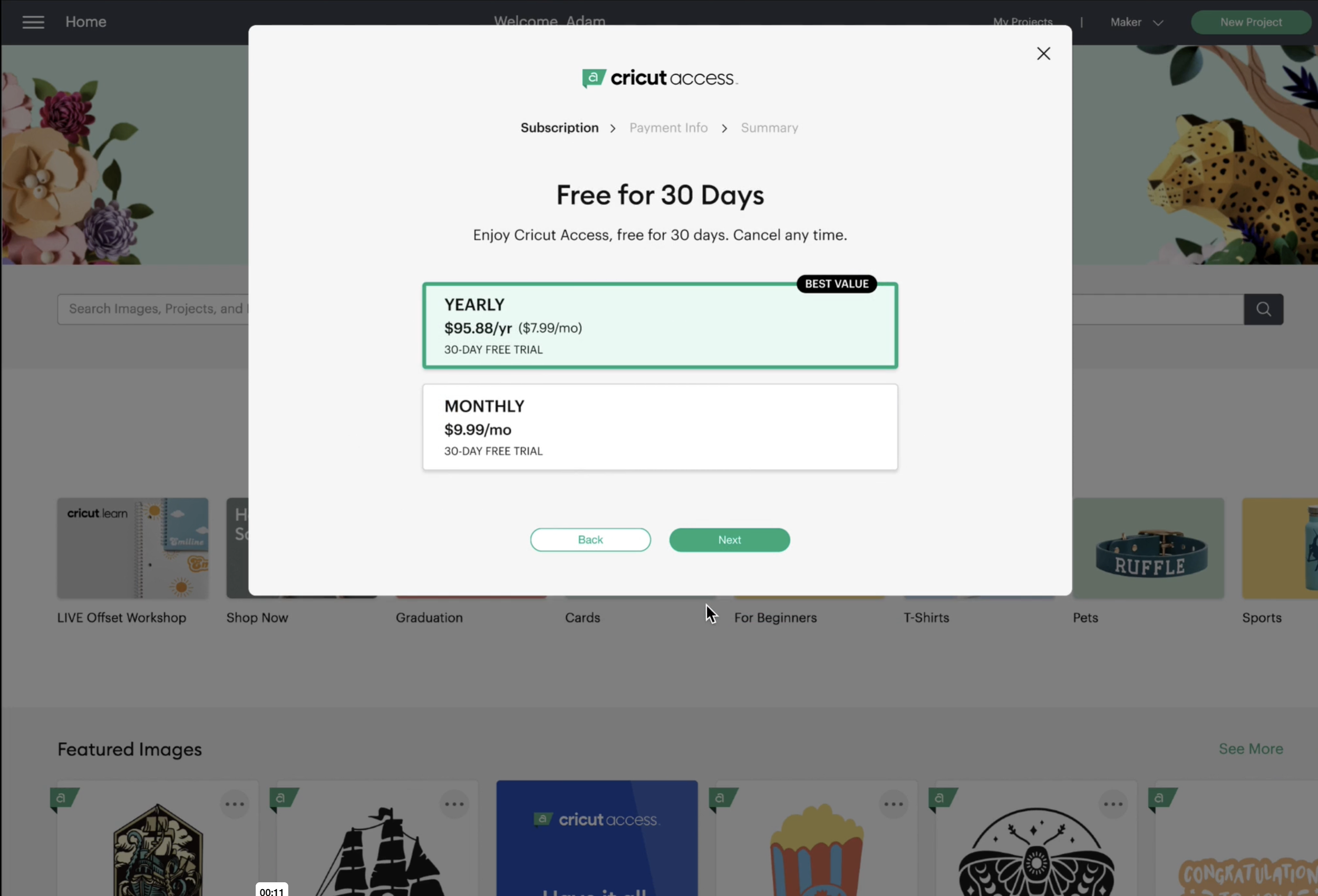
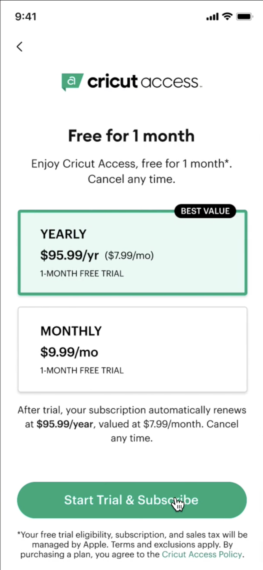
Lack of visual hierarchy. Users could not easily differentiate between monthly and annual plans. The two options sat side by side with similar weight, so the decision felt like a coin flip instead of an obvious value choice.
Unclear pricing breakdown. The savings on the annual plan were not immediately visible. Users had to do mental math to understand why annual was the better deal.
Weak call-to-action. The CTA did not effectively guide users toward the best option. It blended into the layout instead of leading the eye.
Focusing on Key Moments
Instead of redesigning the entire flow, I focused on two critical moments:
The entry point, where the decision to subscribe is made.
The post-purchase experience, where confidence in that decision is either reinforced or lost.
No pricing changes. No checkout changes. Only the moments where confidence is won or lost.
1. Pricing Screen: Making the Smarter Choice Easier
Users struggled to distinguish between monthly and annual plans.
I redesigned the pricing experience around three principles.
Side-by-side plan comparison: I designed a clear comparison layout for monthly versus annual, using color contrast and typography to emphasize the annual plan's value without forcing it on the user.
Cost transparency through progressive disclosure: I integrated savings badges with high-contrast styling, and used hover tooltips to break down what the annual plan actually saves over twelve months. Users could understand the math without the page becoming cluttered.
Stronger calls to action: I redesigned the CTA buttons to be more prominent and action-driven, with subtle hover micro-interactions to improve engagement and signal interactivity.
The goal wasn't to push users into the annual plan. It was to make the smarter choice the obvious one.
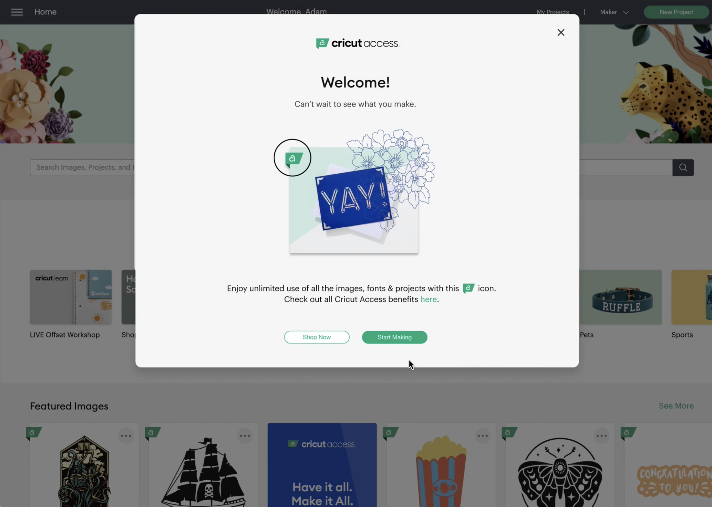
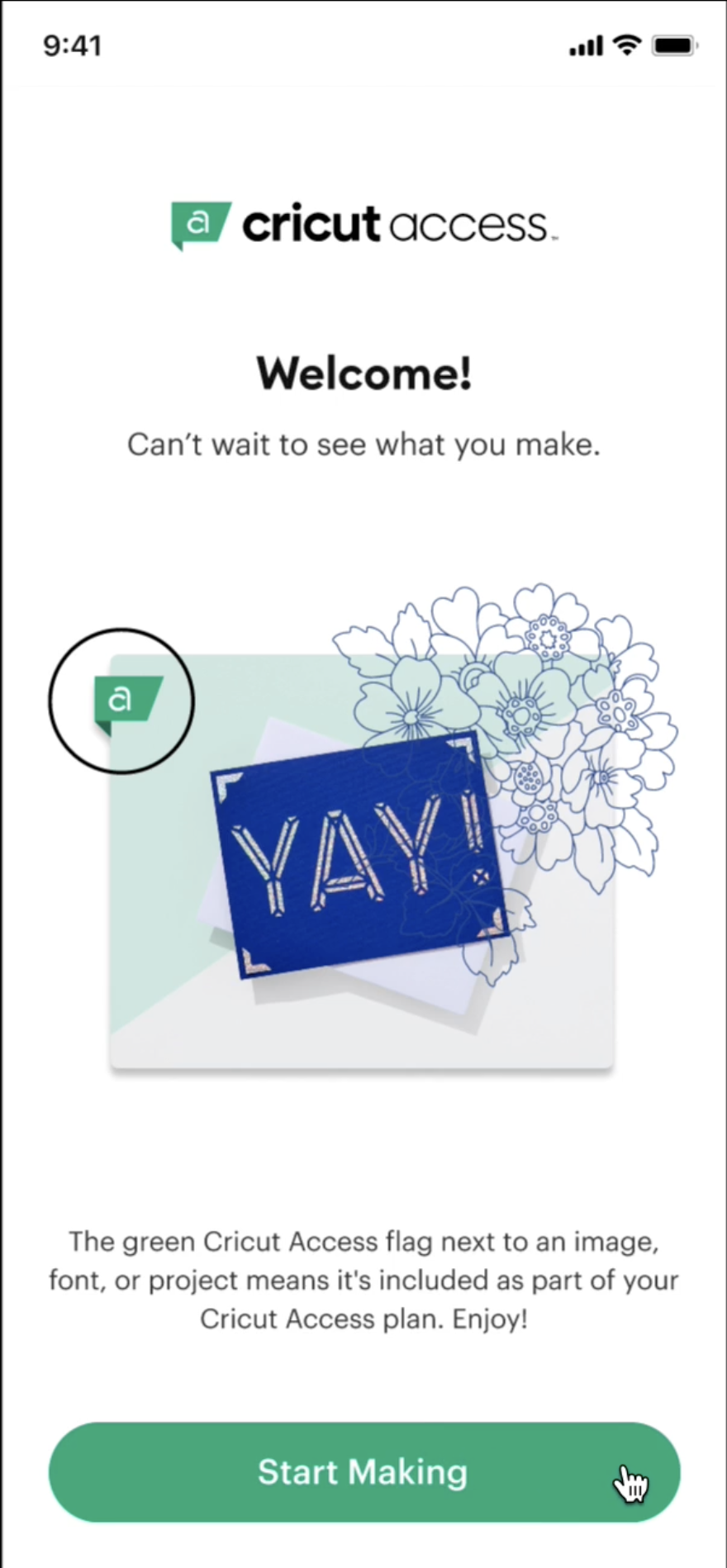
2. Welcome Experience: From Confirmation to Activation
After subscribing, users landed on a generic confirmation screen. No reinforcement of value. No clear next step. The transaction was technically complete, but the experience was emotionally flat at exactly the moment when momentum mattered most.
I redesigned the welcome experience to:
Showcase the assets included in the subscription, so the value was immediately visible.
Introduce a clear "Start Making" call to action that pulled users into the product instead of leaving them at a static screen.
Shift tone from transactional to inviting:
From "Your subscription is active" to "Welcome. Let's start creating."
The Design Process
I worked through this in stages: wireframes to high-fidelity responsive UI, with accessibility built in from the start (WCAG-compliant contrast ratios, font readability, and clear hierarchy at every breakpoint). The work translated UX research findings into a polished, accessible interface that respected both new and returning users.
Outcomes
A pricing experience that made the smarter choice feel obvious, removing cognitive load at the decision point.
A welcome flow that turned a transactional confirmation into an active first step, so users left the funnel already inside the product instead of staring at a static success screen.
A clearer narrative arc from considering to creating, designed to win confidence at the two moments that mattered most.