

HOKA Design System
Role: Lead Designer, Design Systems
Team: UX, Engineering, Marketing
Scope: Figma component library, style guide, CMS templates, tutorials, governance
0 design requests needed
40% faster dev handoff cycles
20+ designers and engineers on one system
1 complete design system built from scratch
What I walked into
On my first week at HOKA, I asked to see the design system.
I was sent two Figma files.
A foundations page.
An elements page.
That was it.
No documented components.
No interaction specs.
No hover states.
No governance.
Designers were recreating the UI from scratch.
Engineers interpreted designs differently.
The same button existed in a dozen variations.
No one knew what was correct.
The ask:
Audit the site.
Figure out what actually exists.
Build a system from it.
This is what I started with…
The audit that changed everything
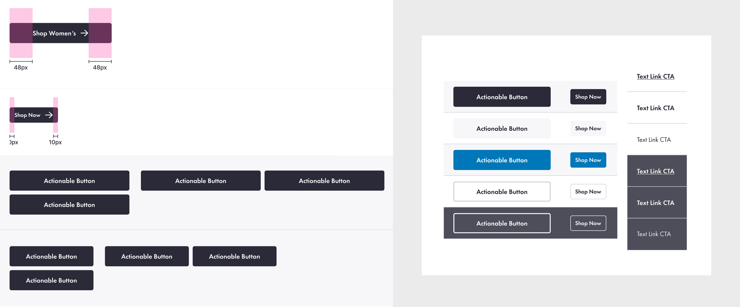
I audited every CTA across the site, documenting structure, states, and behavior.
CTAs were the most inconsistent part of the experience.They were completely inconsistent.
Same action, different styles. Different actions, same style.
The same action could open a page, trigger a modal, or do nothing.
There was no system and no way to predict behavior.
Users had to re-learn the interface on every page.
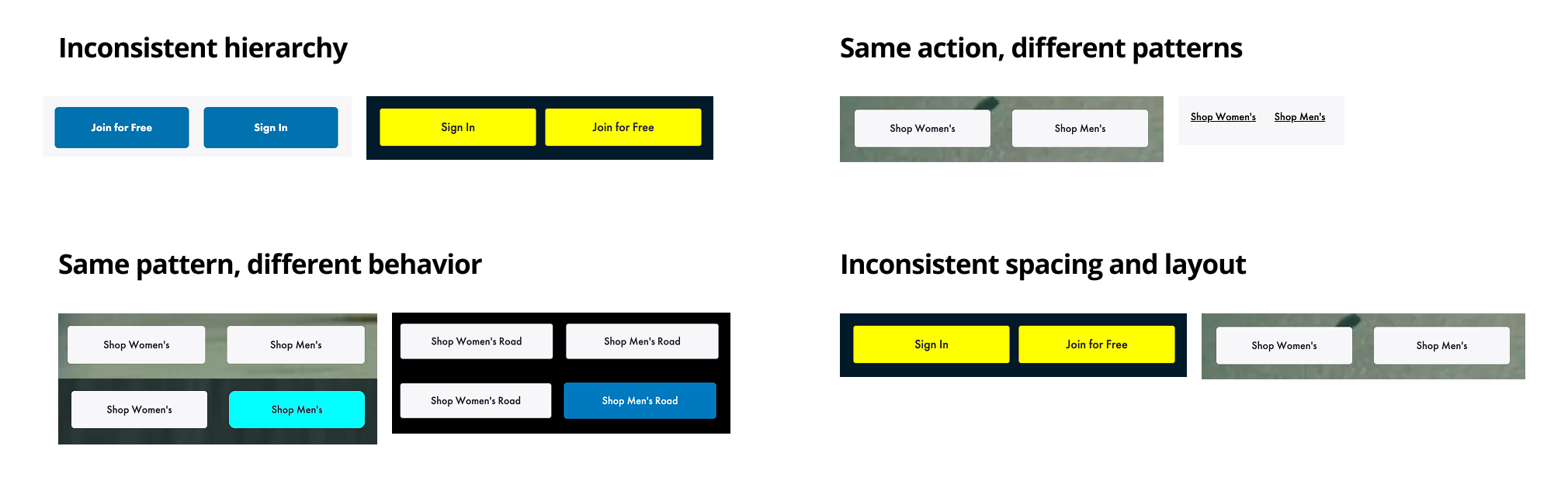
I audited CTAs across the site and found that the same action behaved differently everywhere.
Without consistent rules for structure, states, and behavior, users could not predict what would happen when they clicked.
The same CTA behaved differently across the entire site.
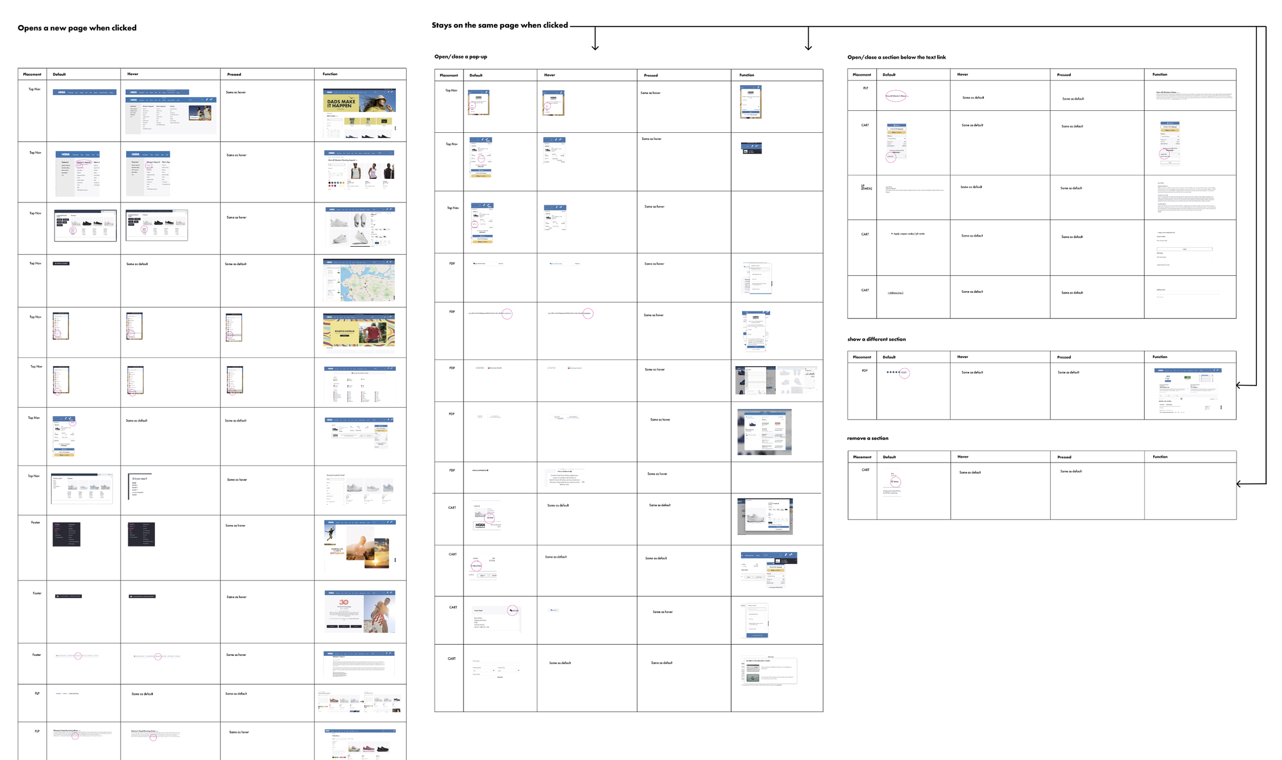
I consolidated dozens of inconsistent buttons into a single, unified system.
Designers stopped guessing.
Engineers stopped reinterpreting.
For the first time, buttons behaved consistently across the entire site.
To fix this, I defined three rules for CTAs:
Hierarchy: Primary vs Secondary actions must be visually consistent
Behavior: Same action must trigger the same outcome
Structure: All buttons follow a defined system of states and spacing
The unified CTA system
Building the system
I structured the system across five layers:
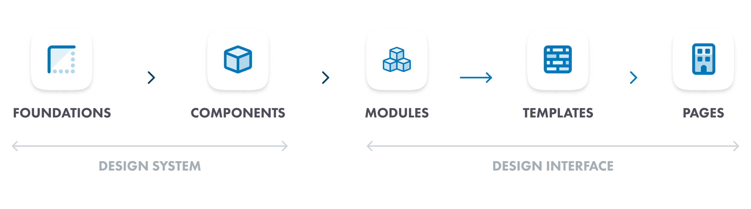
Foundations feed into components, components feed into modules, modules feed into templates, and templates assemble into pages. Every layer has clear rules so the system scales without breaking.
With the audit as my foundation, I built HOKA's design system from the ground up in Figma.
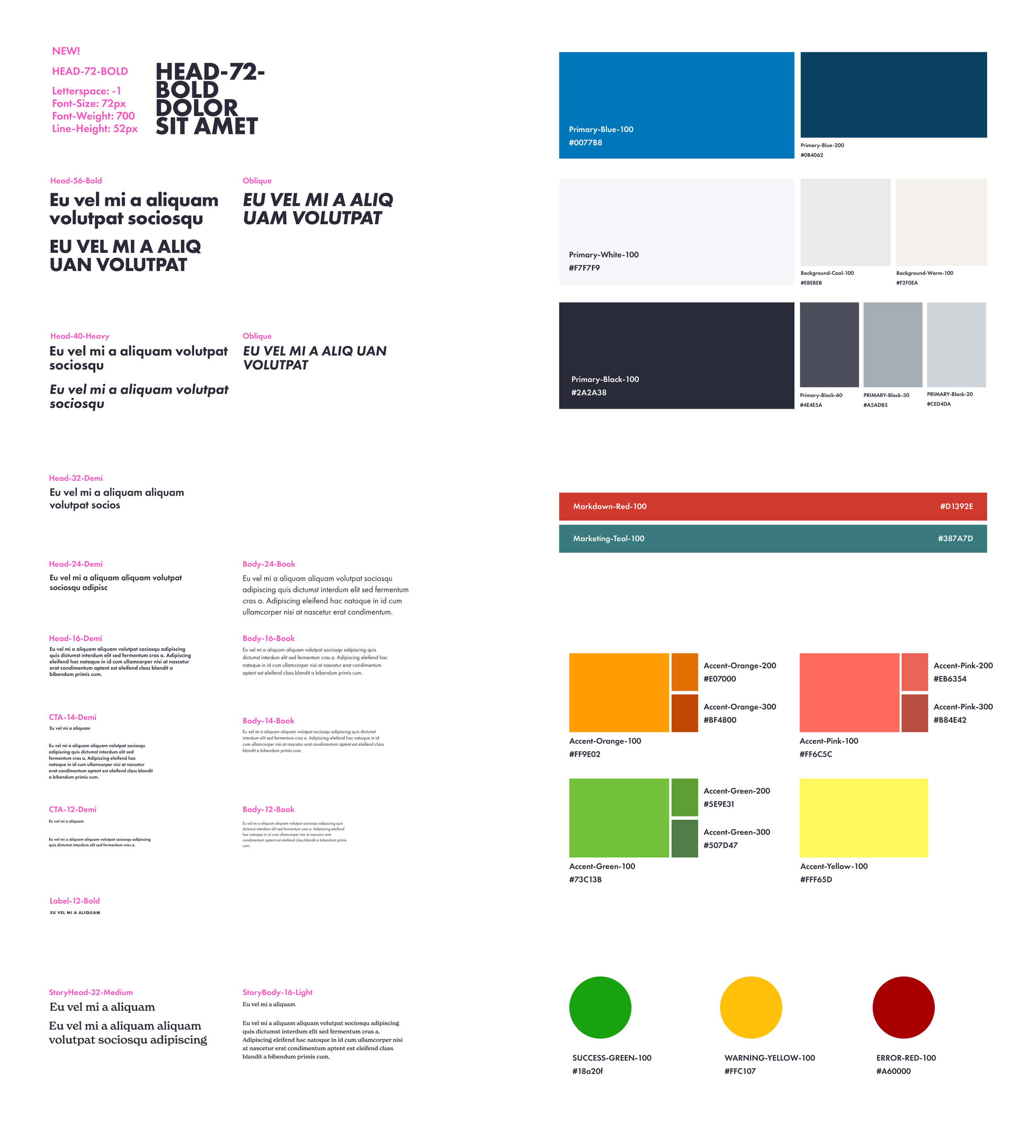
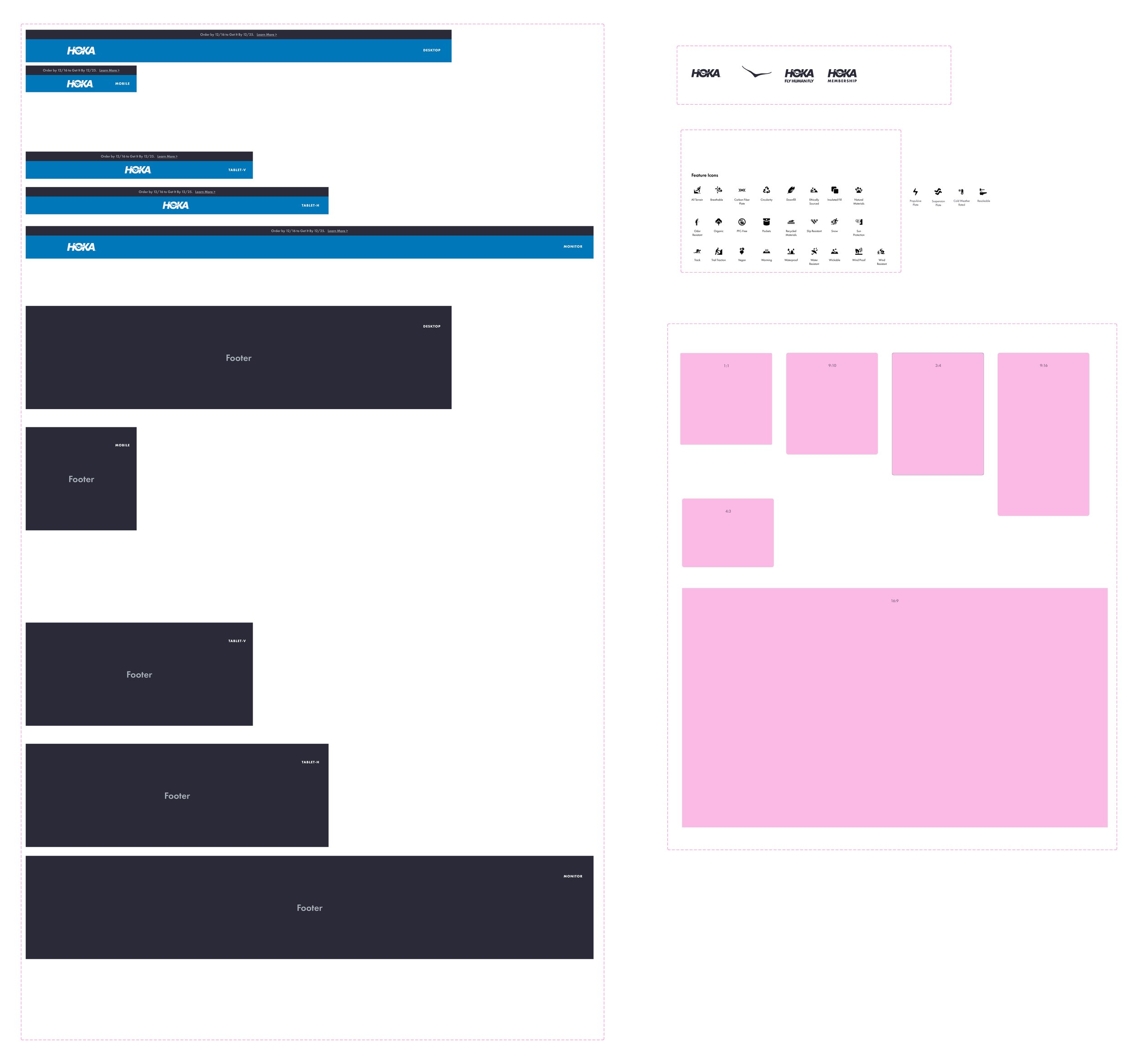
Every component was built with full documentation: states, options, margins, padding, text specs, dividers, and responsive behavior for every breakpoint (375, 768, 1024, 1440, 1920).
Components I built and documented: Every component was built with full documentation: states, options, margins, padding, text specs, dividers, and responsive behavior for every breakpoint.
For every component, I didn't just design it. I researched it. The text link component, for example, started with competitor research into how Apple and other platforms handle inline links, then I mapped unique text links versus inline text links, documented current versus future states, and defined anchor link versus new page behavior.
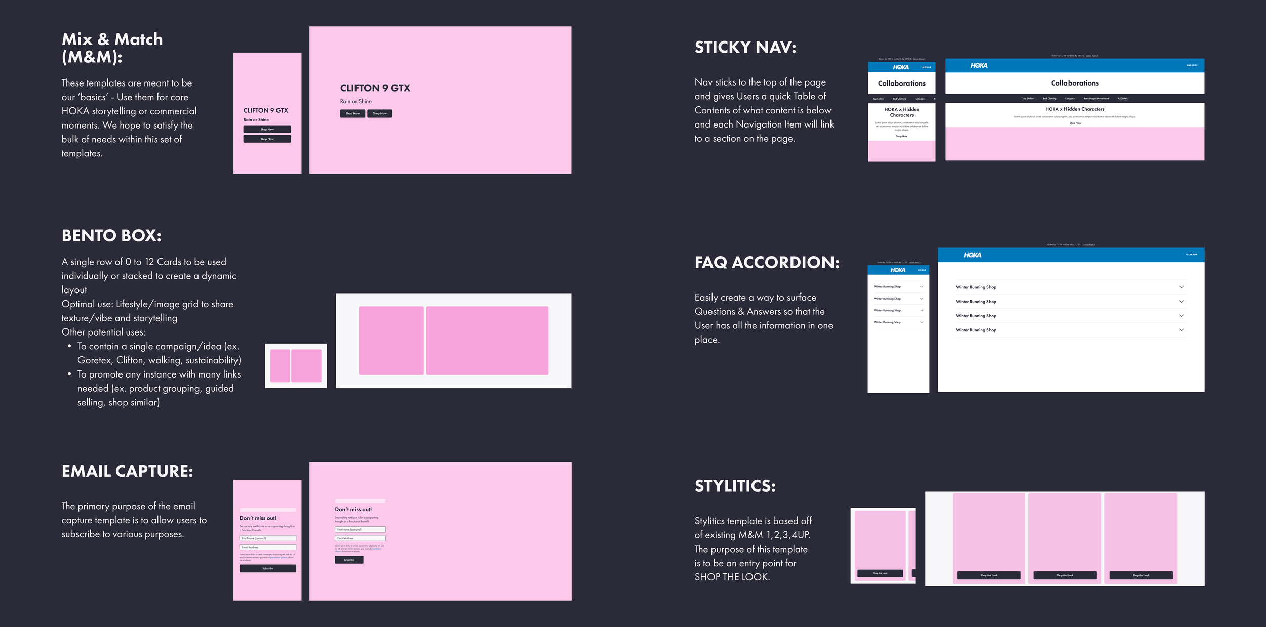
Photo guidelines
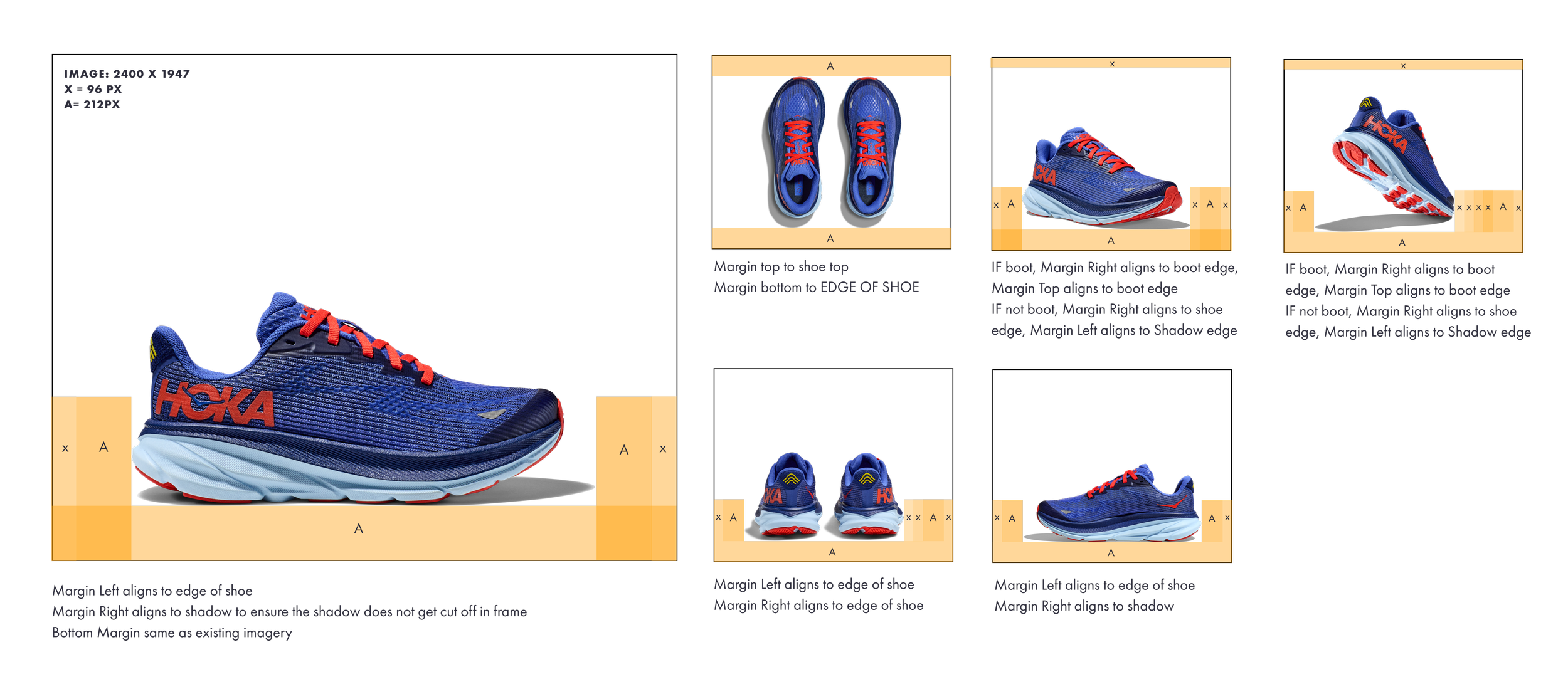
HOKA had photo guidelines for adult shoes but nothing for kids. I measured every margin, alignment, and negative space rule from the existing adult product photography, then created a kids-specific guideline from scratch to ensure consistency across the entire product catalog. Every angle (side, top, bottom, boot, non-boot) has specific margin and alignment rules documented with exact pixel values.
CMS templates: designing myself out of a job
The most impactful part of this project was not the components. It was the CMS template library.
I realized that every time marketing needed a new landing page or campaign page, they filed a design request and waited. That bottleneck was slowing down the entire organization. So I built a template system that let content editors build pages themselves.
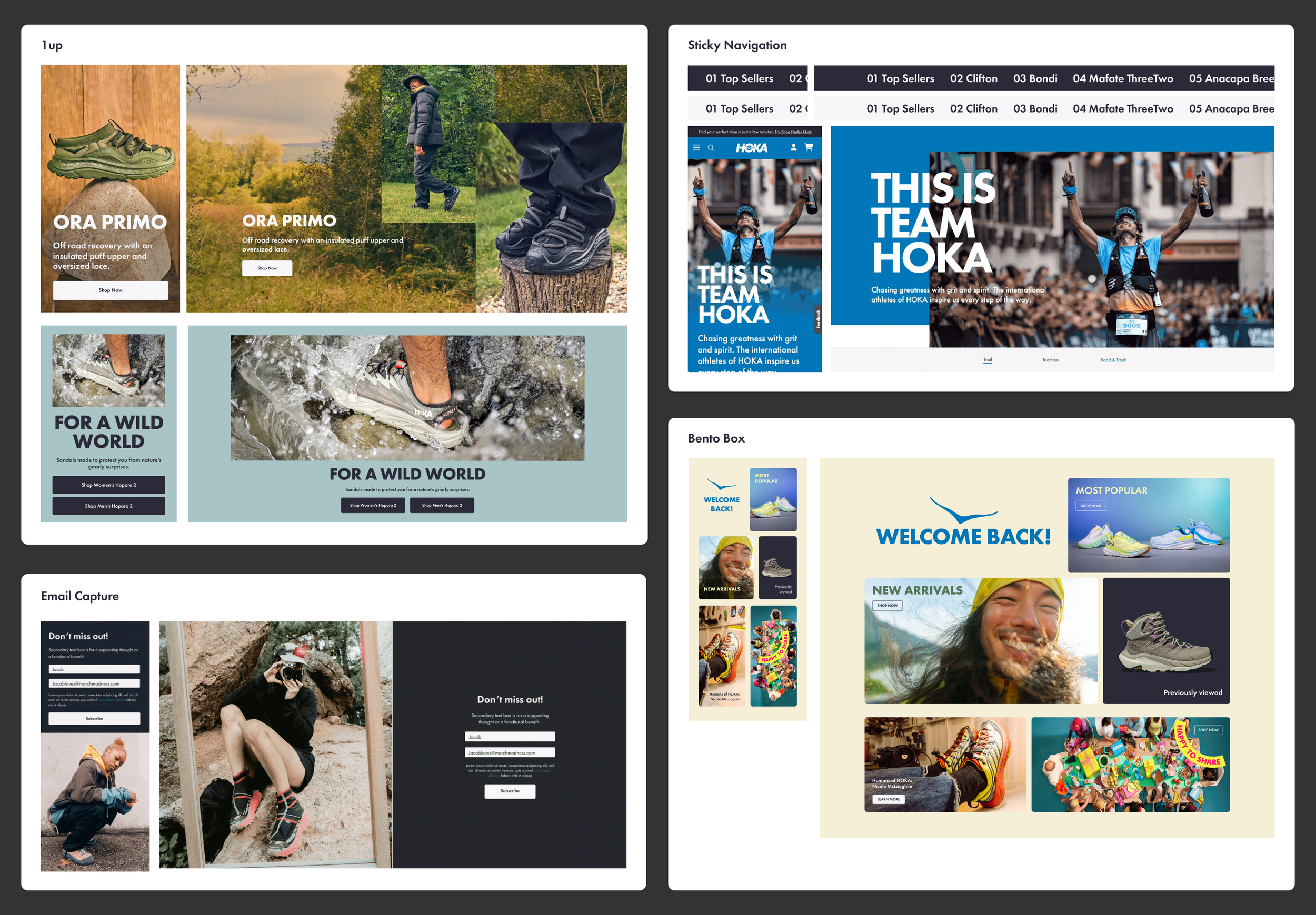
The system uses a Mix and Match approach: 1-up, 2-up, 3-up, 4-up, and 6-up layouts, each available in full bleed, in-container, and 50/50 inset variations. Every template includes rules for CTA placement, character counts, image aspect ratios, and responsive behavior. I also built a video feature component with Cloudinary integration, background and foreground video options, and responsive playback controls.
To make sure templates shipped correctly,
I created a 10-step checkpoint process:
Info gathering from design
Questions answered by team
Design delivery to dev
Dev questions answered
Tech demo
Content editor test build
Tutorial build by designer
Tutorial shared with team
Template component built
Template component shared
Now versus future
I didn't just document what existed. I documented where the system was going. For each major component, I created side-by-side views showing the current state and the proposed future state, with specific annotations on what would change: type sizes, content box positioning, alignment rules.
This gave the team a shared roadmap. Designers knew what was coming. Engineers could plan ahead. Marketing understood why things would look different in six months.
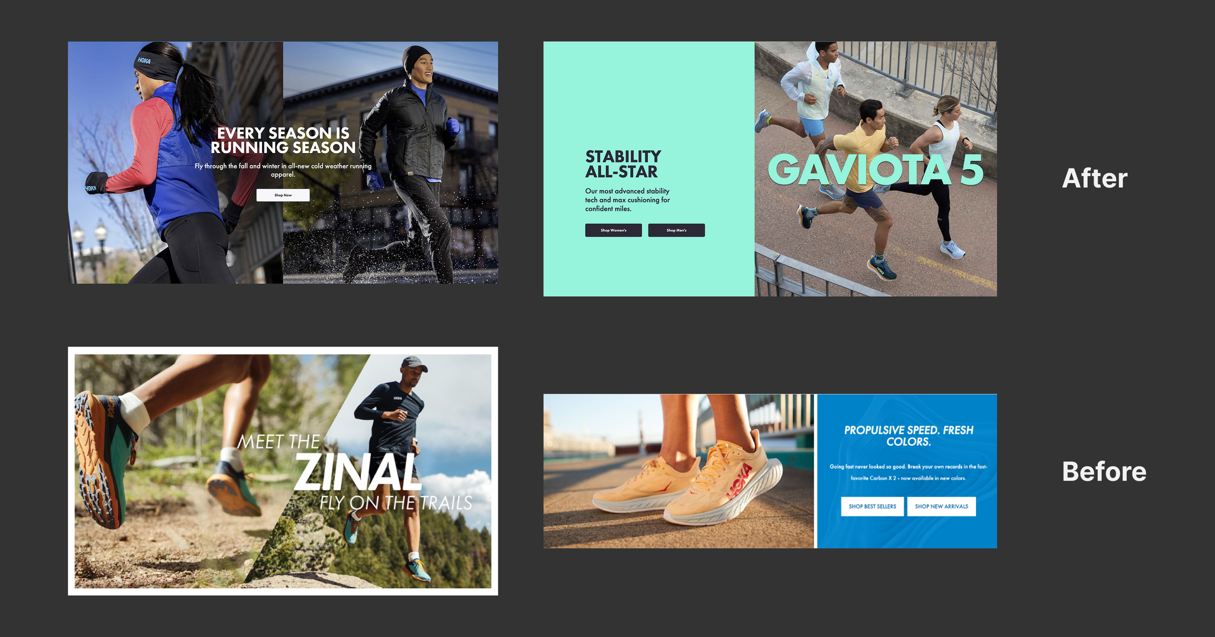
Before and after: pages built without the system vs. pages built with it.
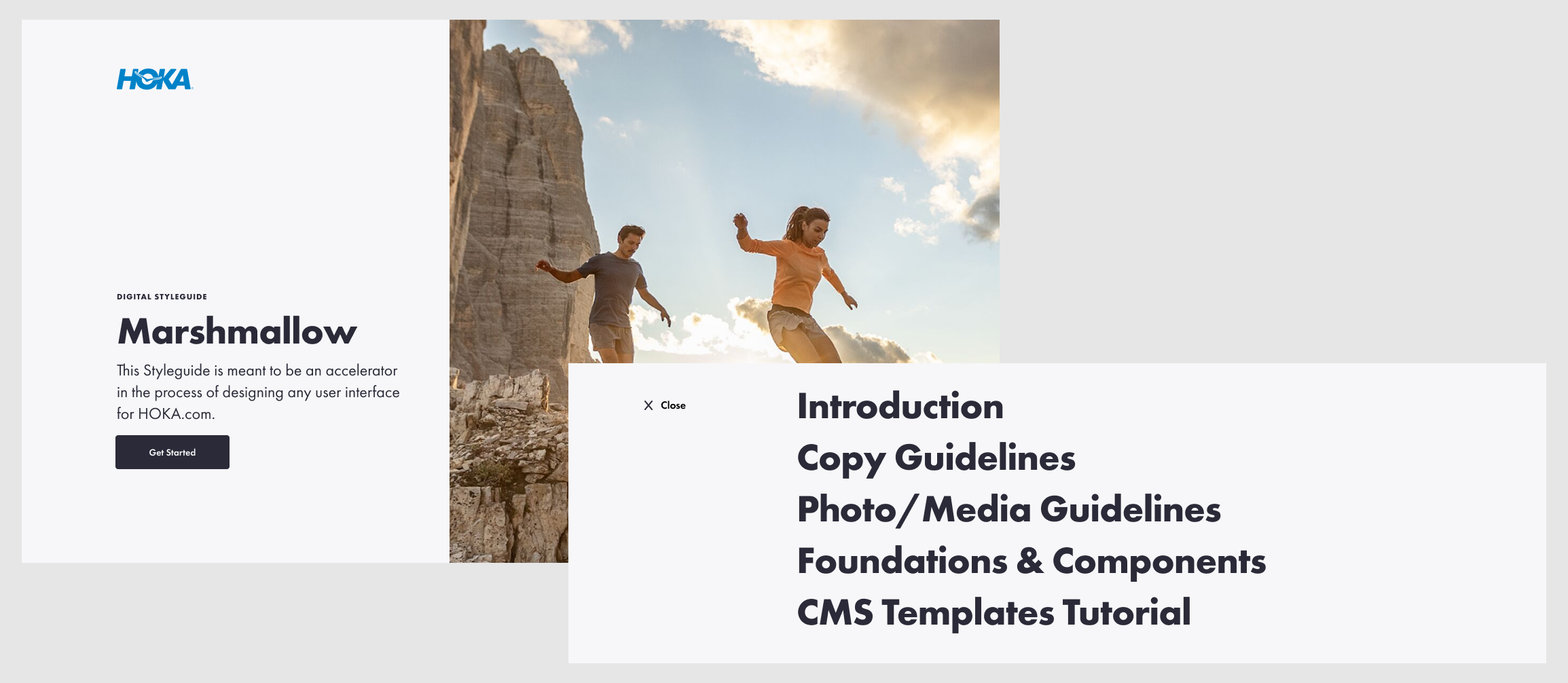
Marshmallow: the source of truth
The scattered style guide HOKA had when I started was called Marshmallow. By the time I was done, Marshmallow was a fully governed, browsable system covering seven sections: Introduction, Copy Guidelines, Photo/Media Guidelines, Foundations and Components, CMS Templates, and Tutorials.
It went from a name on a half-empty file to the single source of truth for anyone designing or building for HOKA.com.
Teaching the system
A design system nobody uses is just a Figma file. I knew adoption would be the hardest part. So I built animated tutorial walkthroughs for every major component and template. Each tutorial walks through the component step by step: what it is, how it works, what the rules are, and what content editors can and cannot change.
These tutorials were designed for designers and non-designers. Marketing managers, content editors, and engineers could watch a 2-minute animation and understand exactly how to use a component without asking a designer for help.
What I learned
The hardest design problem at HOKA was not visual. It was organizational. Twenty people were designing for the same website with no shared language, no shared components, and no shared rules. The system I built didn't just make the site more consistent. It changed how the team worked together.
The CMS templates were the proof. When a marketing manager can build a campaign page in an afternoon without filing a design request, that's not a Figma library. That's infrastructure. And infrastructure is what separates a design system that gets praised in a meeting from one that actually gets used every day.