

UI Design
HOKA Shoe Finder LP

Objective
The HOKA Shoe Finder will help users find the best shoe by asking them a few simple questions. The goal of this flow is to find users a terrific match whether they're walking around town, running for recreation, or preparing for a marathon.
Execution
We were able to develop a flow to up-sell the shoes while additionally showcasing all the other options that would also be the ideal fit for consumers by using the page's narrative to guide them and the clear usage of grid systems and hierarchy therein. You can view, search for, and purchase every style of footwear that HOKA has available in this flow. This adventure is incredibly easy to read, comprehend, and purchase for the user.
Common UI Patterns
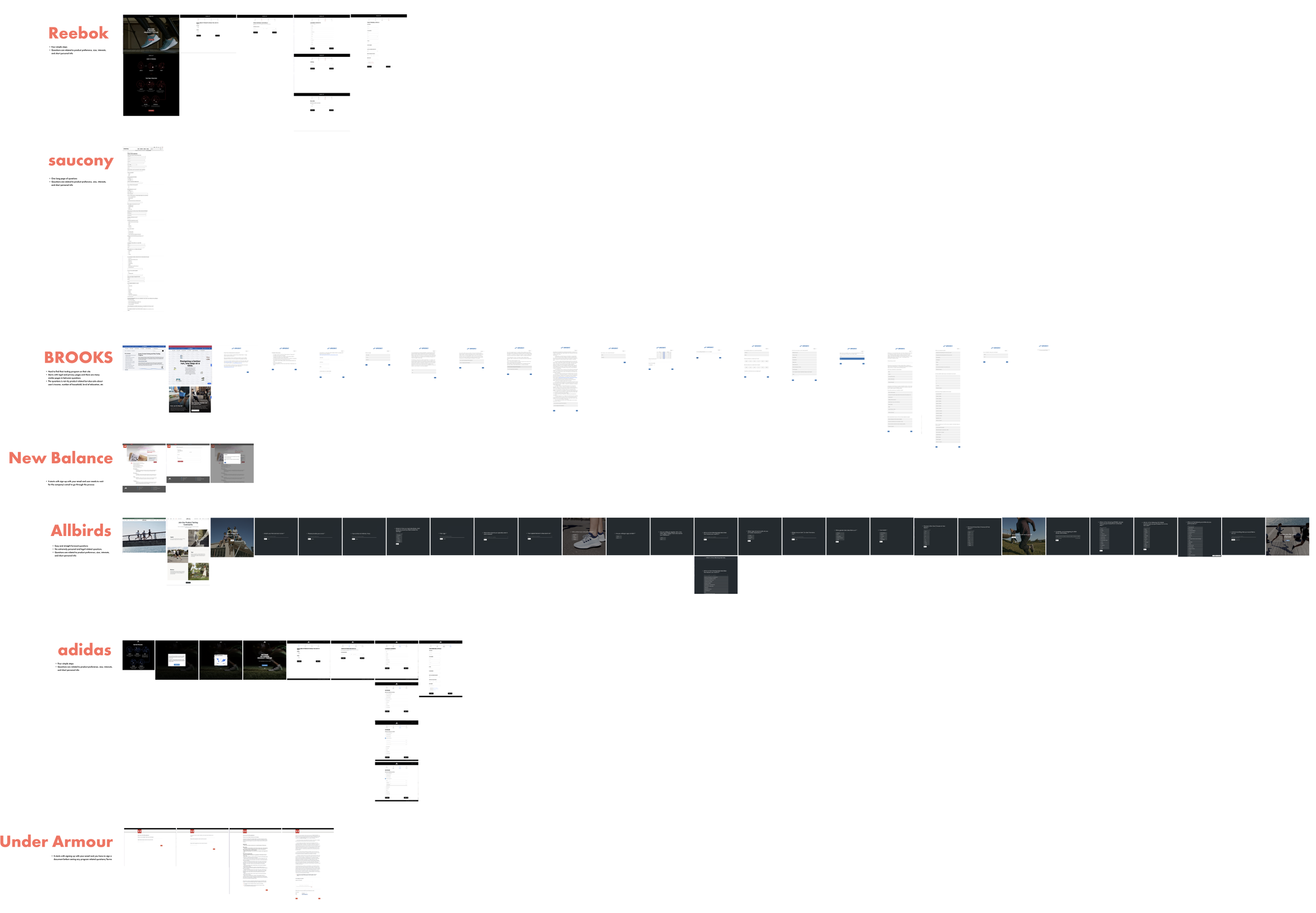
I started to create Landing Page for this journey by looking at different but common user interface patterns. I compared Reebok, Saucony, Brooks, New Blance, Allbirds, Adidas, and Under Armour. I found their strengths and started to design based on that result.
Reebok:
• Four simple steps
• Questions are related to product preference, size, interests, and short personal info
Saucony:
• One long page of questions
• Questions are related to product preference, size, interests, and short personal info
Brooks:
• Hard to find their testing program on their site
• Starts with legal and privacy pages and there are many similar pages in between questions
• The questions is not only product related but also asks about user’s income, number of household, level of education, etc
New Balance:
•It starts with sign-up with your email and user needs to wait for the company’s email to go through the process
Allbirds:
• Easy and straight forward questions
• No extremely personal and legal related questions
• Questions are related to product preference, size, interests, and short personal info
Adidas:
• Four simple steps
• Questions are related to product preference, size, interests, and short personal info
Under Armour:
• It starts with signing up with your email and you have to sign a document before seeing any program related questions/forms
User Flow
Base on what I found in my Common UI Patterns, I mapped out the user journey form the entry point of this flow to the end point.

Hi-Fi
I created this Hi-Fi after research of Common UI Patterns and mapping out the user flow to make the journey as smooth as possible.

