

Mobile App . Branding
COVA

Project Background
COVID-19, short for the coronavirus disease 2019, has spread to almost every country and territory around the world, infecting millions of people and devastating the global economy. In different states of the United States. They vaccinate people in two phases but the COVID-19 Appointment booking platforms are complicated and mostly not up to date. Finding appointments and accurate COVID-19 information can be a nightmare. The purpose of the Covid-19 vaccine and test finder will be to simplify the process for users and vaccination centers. Eligible users are offered a list of vaccine locations and test centers with a map to select a place more convenient for them. Pharmacies and vaccine centers each use an individual system to show their inventory and availability of the vaccines. The different platforms made users frustrated to not have all the information in one place. There is a need to centralize resources in one place.
High-Level Design Goals and Objectives
A map to show vaccine and test location’s information
A calendar to show available vaccine/test appointments
A filter to show types of vaccine and their availability in different locations
Research
Heuristic Analysis
Heuristic Analysis was the first step to start my research. For making this application, I had to observe the strengths and weaknesses in both booking and map apps. I tried to learn more about maps and booking system through applications that has these functions to create a seamless flow for my users by identifying their struggles and needs.
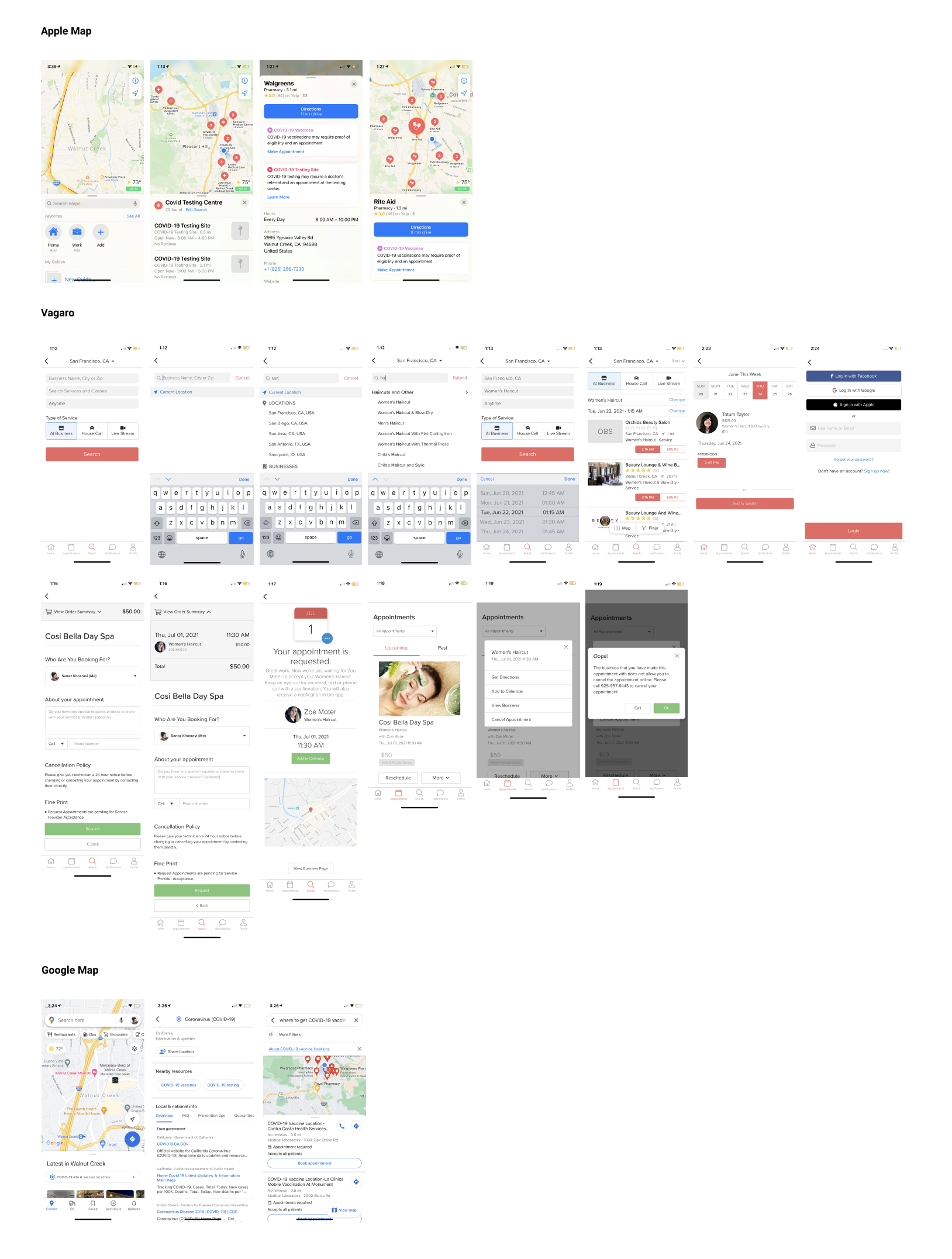
Apple Map
Strengths
-Marked COVID-19 testing centers with specific icon
-Provides options of map search pr list of search results
-Search results shows hours and distance
-Once choose a location, it lists COVID test/ vaccine availability, hours, address, phone, website, and review
Weaknesses
-Does not show if the testing site needs a referral or appointment
-“Make Appointment” takes user to an external website
-Does not show the type of vaccines offered in the location
-There is no filtering options
-Preview of search results only show distance not the address
Vagaro
Strengths
-Many filters and suggestions available
-Search results show reviews, city, and distance
-Users can book directly on the app
-Search results and map view both available
-Shows if the business is following guideline to protect against the spread of COVID-19 and marked them as “COVID-19 Ready”
-Users can either book an appointment or add to waitlist
-Confirmation page has a map, date, time, and Add to Calendar CTA.
-Order summary page includes date, time, price, service, a person who the service is schedule with, and cancellation policy.
Weaknesses
-Search result preview does not include the address
-Search result does not list the business hours
Google Map
Strengths
-COVID-19 info & vaccine locations available once users open the app
-It has search filters
-Provides options of map search pr list of search results
-The search result shows the name of the location, distance, phone number, address, review, and if appointments are required
-The search result shows if the location has an appointment available
Weaknesses
-“Make Appointment” takes user to an external website
-Does not show the type of vaccines offered in the location
Survey
Research Goals
Figure out the users struggles and frustrations to find vaccine or test center
Identify the the weaknesses and strengths with the current scheduling system
Identify users expectations of the app
Participants
16 participants
Anybody who is trying to find COVID-19 vaccine or test locations
COVA Survey Findings
- 40% of participants searched 4 or more sources to be able to book their COVID-19 appointment.
-12 out of 15 participants were able to choose their preferred time and date of the appointment.
-2 out of 15 participants prefer to create an account to book their appointment.
-13 out of 15 using Google maps to find a location.
Frustrations:
Had to deal with a potential long wait time due to high demand
Not possible to choose a vaccine type (Moderna/J&J/Pfizer)
Not be able to choose the time and date of the appointment
Unable to schedule a second dose of vaccine
Had to re-enter information every time they tried to find a new appointment
Had to fill out lots of information about eligibility before making an appointment
Searching and calling so many sources to find an appointment
Had problem modifying the appointment after they booked it
Expectations:
Fast and less steps for a booking process
Follow up /confirmation email for the booking with links to edit/change/cancel directly
Being able to search all appointments for their preferred variables: distance, time of appointment, type of vaccine, type of center (e.g., clinic, pharmacy, etc.)
Quick register with name, birthday, phone, and email
Filters that show appointments on weekdays between X and X time
Having a calendar, online check-in, and language feature
Can easily edit the route on the map
Persona Development
This persona works from home since the pandemic happened and she is looking to get vaccinated as soon as possible to get back to her work and normal life. She is too busy to deal with the long wait and tired of not being able to find appointment that works with her schedule. She is looking for an application to book her appointment fast and easy.

Define
Sitemap
based on my research, I created this sitemap with three sections of vaccine, test, and profile for users.

Task Flow
In these task flows, user wants to book a vaccine appointment, test appointment, and check the time/date of their appointments.

User Flow
In this user flow, my user needs to book a vaccine appointment for preferred time and date.

Ideate
Wireframes
After researched common UI design patterns, I used whimsical to create my desired flow by combining the solutions and visual patterns.

Logo & Style Tile
For this application, I came up with the name COVA, which is a combination of COvid and VAccine. Then, I sketched some logos from the letters C-O-V-A and I chose this shade of teal color because it evokes the feeling of trust, safe and relaxation in users.


Prototype
Hi-Fi Screens
By using all the information I gained in the process of making this app, I developed the high-fidelity screens. I learned more about page structure and hierarchy among text. Based on the feedback, I realized the navigation was a bit confusing in my initial design and I had a complicated map search. Then, I iterated my map search to use less buttons and more simple, straight forward screens for users.

Prototype
This prototype allows users to book and reschedule their Covid vaccine and test appointments.
Test
Usability Test
Testing Goals:
- Observe if the flow of booking appointment is easy to complete
- Recognize possible pain points through the process
- Observe users’ interaction with the app
Test Subject:
Hi-Fi prototype of COVA App
Methodology:
Remote User Observation of prototype
Participants:
- 14 participants
- Anybody who is trying to find COVID-19 vaccine or test locations
Results:
12 out of 14 participants rated filters as “very clear”
1 out of 14 participants gave up on applying filters screen
1 out of 14 participants gave up on personal information form screen
1 out of 14 participants gave up on select time and date screen
Misclick rate on choosing pharmacy page in 100%
Average success on applying filters were 92.9%
Average success on Find a Location were 7.1%
Average success on Book an Appointment were 71.4%
Average success on Reschedule Appointment were 71.4%
Participants comments:
Very clear and easy to use and intuitive
Preferred "Pfizer" was already selected since they filtered it before
Having to click "go" every time they entered words into a form felt a bit clunky
Misclicked on the CVS store of interest screen because they have to click on the arrow in order to move forward instead of just the overall container/area of the store and that was confusing.
Iterations


Reflection
Designing end-to-end needs a lot of focus on users’ perspective. I learned to constantly try to see the whole idea through the lens of the users and not myself as a designer. I realized designing an eye pleasing UI patterns needs to combine with being functional as well to make a seamless flow for users. The easiest part was usability test in this project and I think this app is what people need at this time. So, many participants responded to do my test.
Nest Step
Usability test to check if the iterated version of my app is easier to use for the users.